My Creative Process
Letting the work reveal itself
My background in narrative therapy has profoundly shaped not just the themes I explore, but the structure of my creative process itself. Just as narrative therapy invites people to look back on their stories and notice what they reveal about their values, strengths, and longings, my creative process deliberately separates the art-making from the meaning-making - trusting that meaning will emerge in its own time.
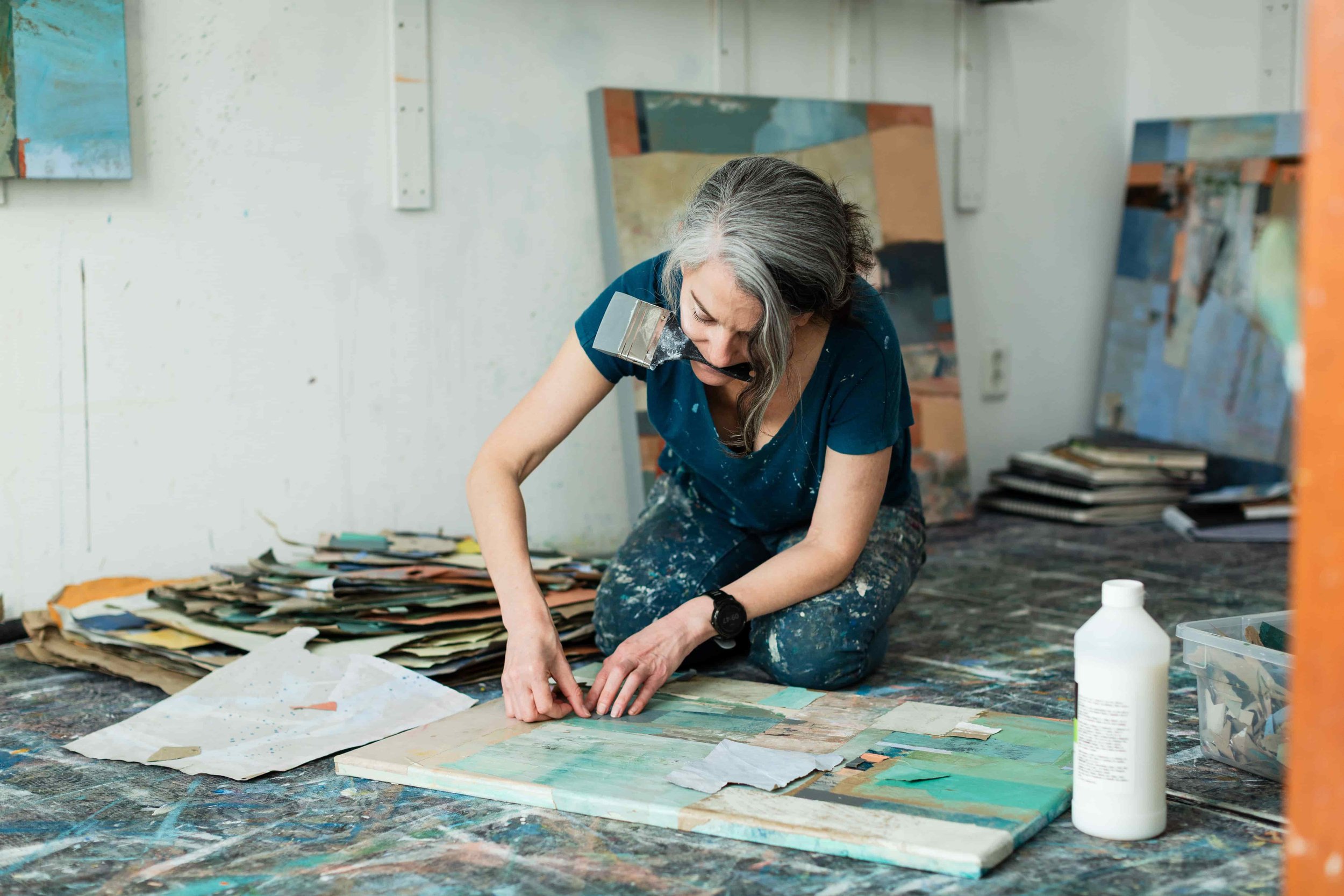
When beginning an artwork, I resist the impulse to know in advance what it will say. Instead, I focus on what delights: colour, texture, and composition. Working intuitively, I cover the canvas with paint and paper to form an initial composition, then develop the work through layers - deepening colour, texture, and spatial depth, often changing the artwork significantly from where it began. This keeps the art-making free from the pressure to illustrate or explain. The artwork is allowed to become something before I ask what it is.
A dialogue with poetry
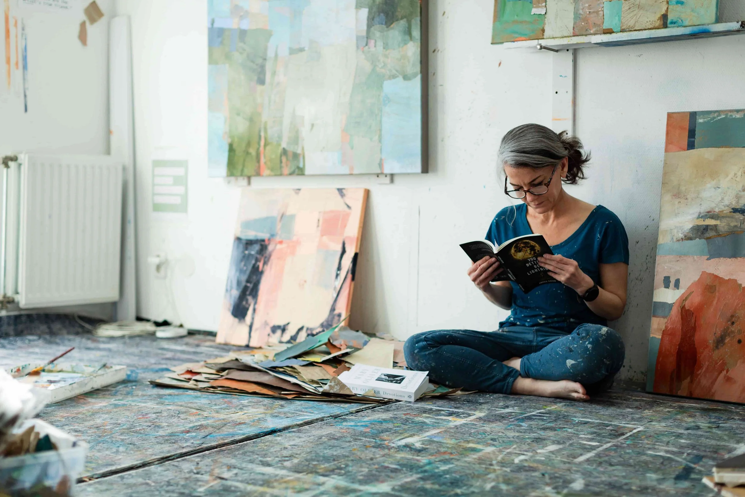
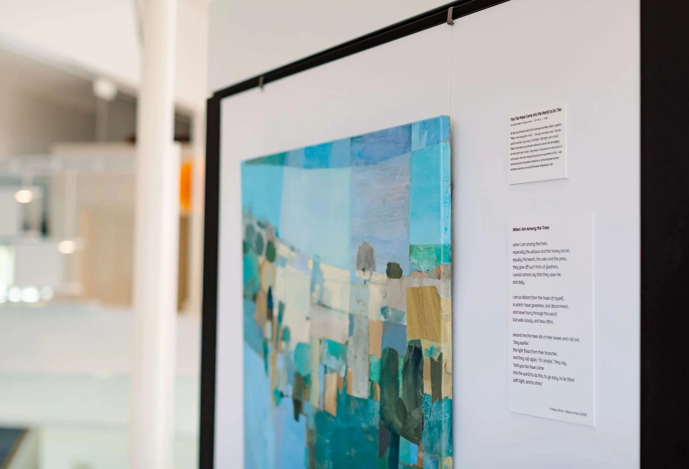
It's only near completion - sometimes after an artwork is finished - that I turn toward it the way one might turn toward a significant life experience in a therapy session. I sit with the work, journal about what it evokes, notice its qualities - its light, its tensions, its textures - and read poetry until something begins to resonate. Out of this reflective process, the artwork's title and story emerge. This naming and storying of the piece is a final act of meaning-making that completes it.
Reading poetry nourishes my creative life. It sharpens my attention, deepens my sensitivity to experience, language, and metaphor, and offers me more ways of expressing myself.
Several titles in my Topophilia series echo lines from poets who write about human longing and grief, and about nature's beauty, intelligence, fragility, and awe. Together, the poems and artworks form a dialogue - art and language as twin vessels for expressing what is felt but often difficult to say.
Story as a layer of the work
The story written to accompany each artwork becomes another essential layer of the creative work. Collectors frequently tell me that the story fits something they've been sitting with - a longing they've been holding, something they needed to remember - sometimes before they've even finished reading it.
I've come to understand this naming and storying as carrying genuine therapeutic resonance: affirming what the viewer values, articulating what is difficult to name, and offering a kind of companionship within the inner landscape.
Sometimes it even feels like it turns the artwork into a kind of prayer that collectors select for themselves.
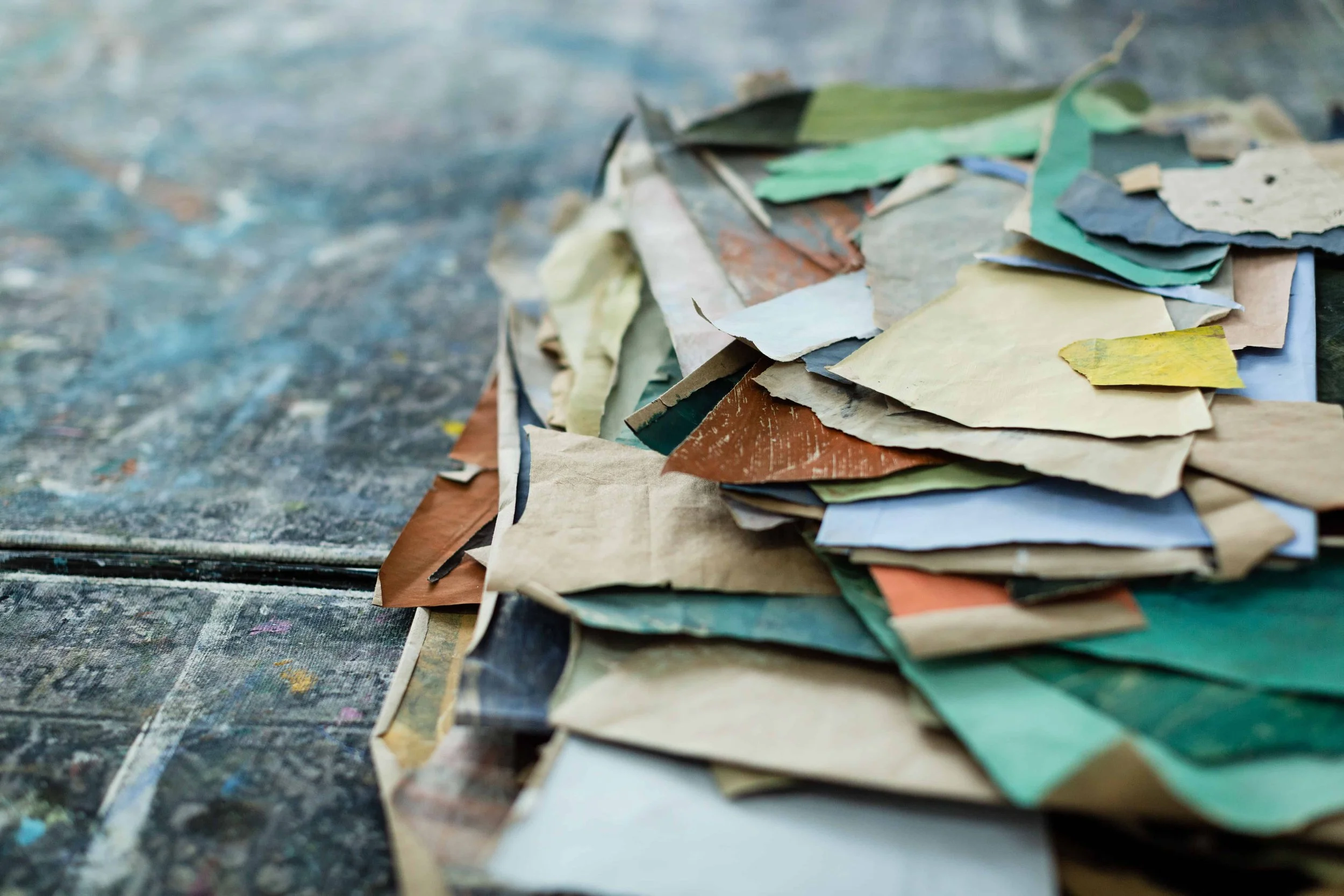
Working with recycled materials
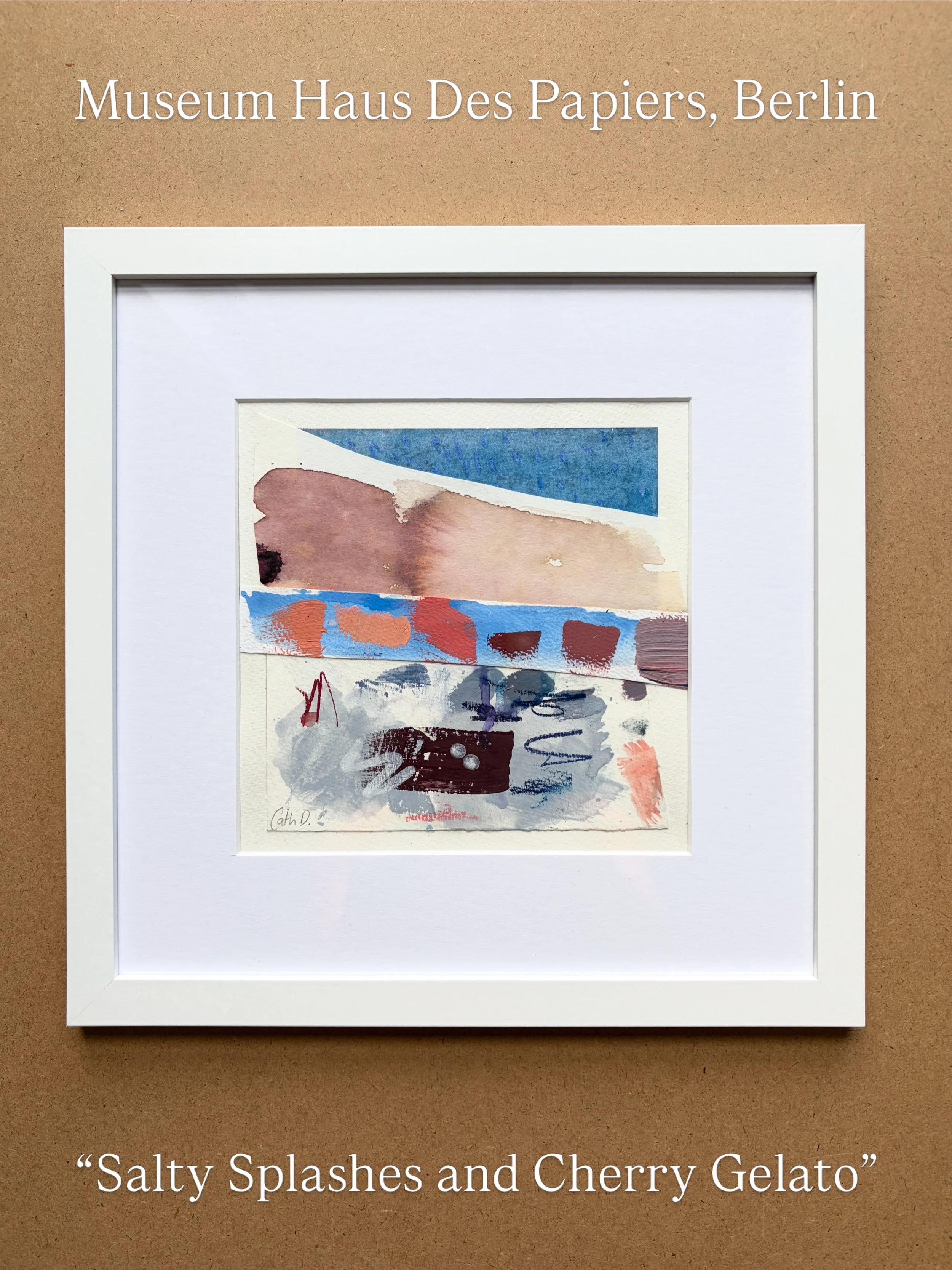
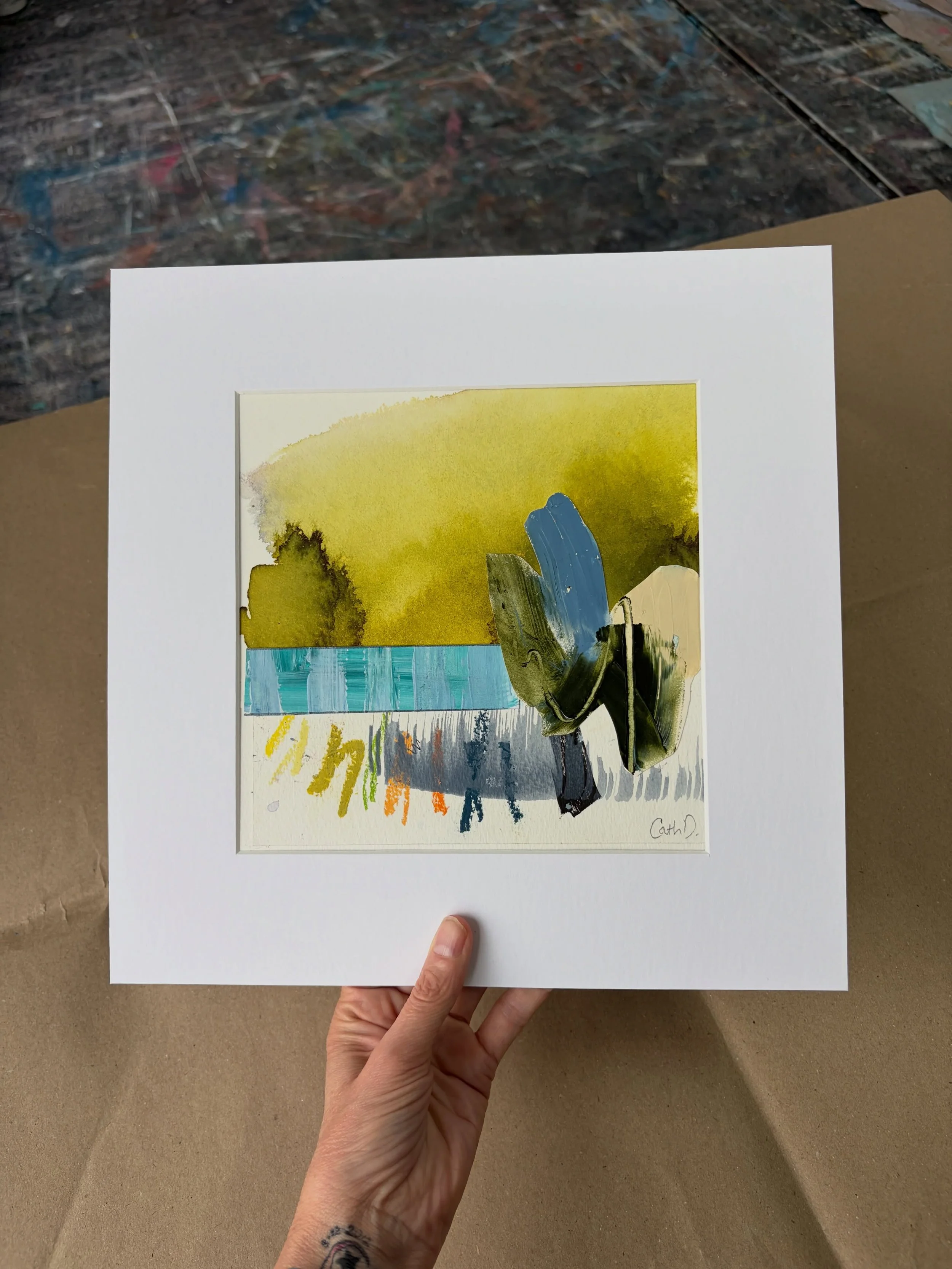
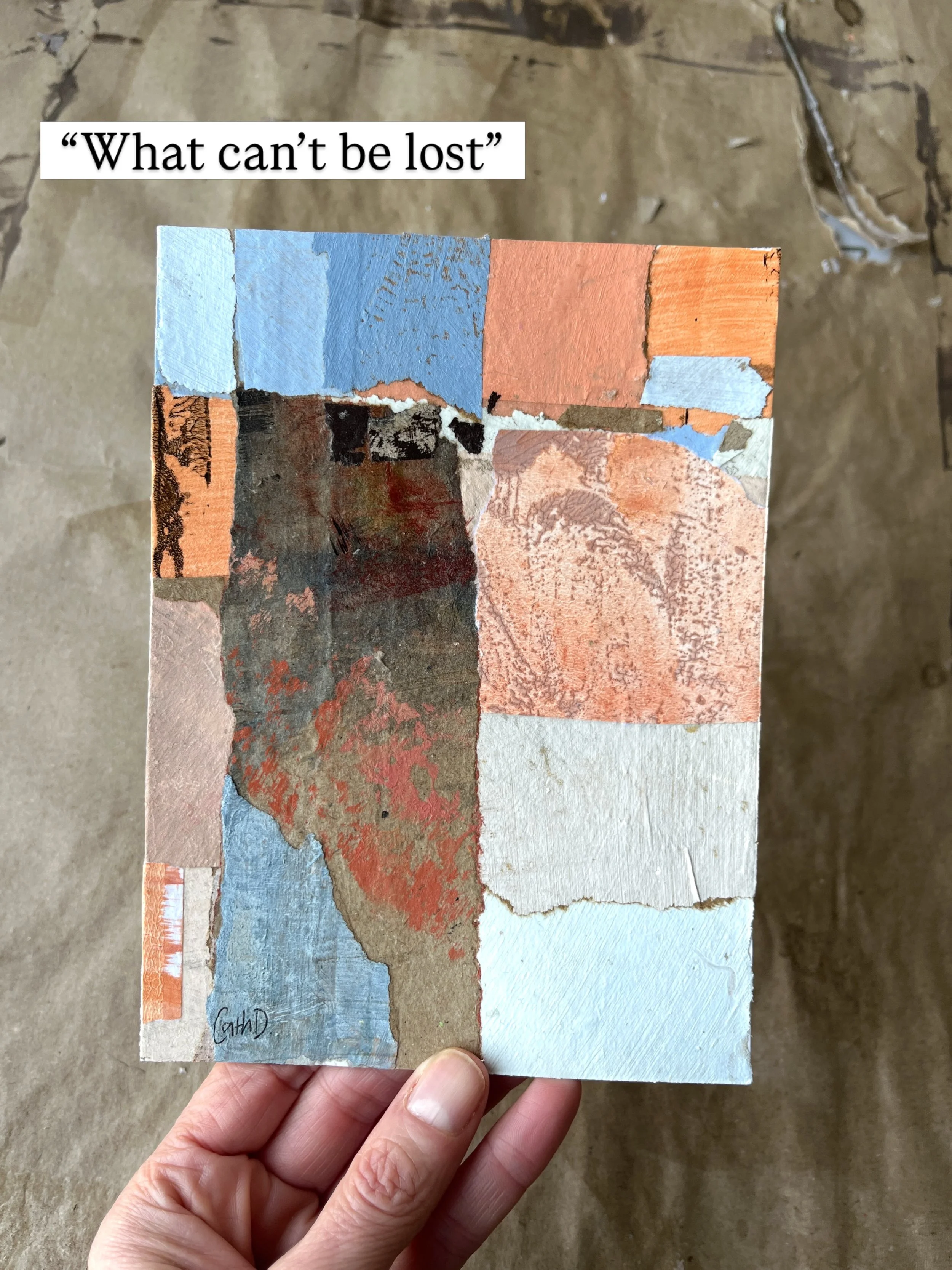
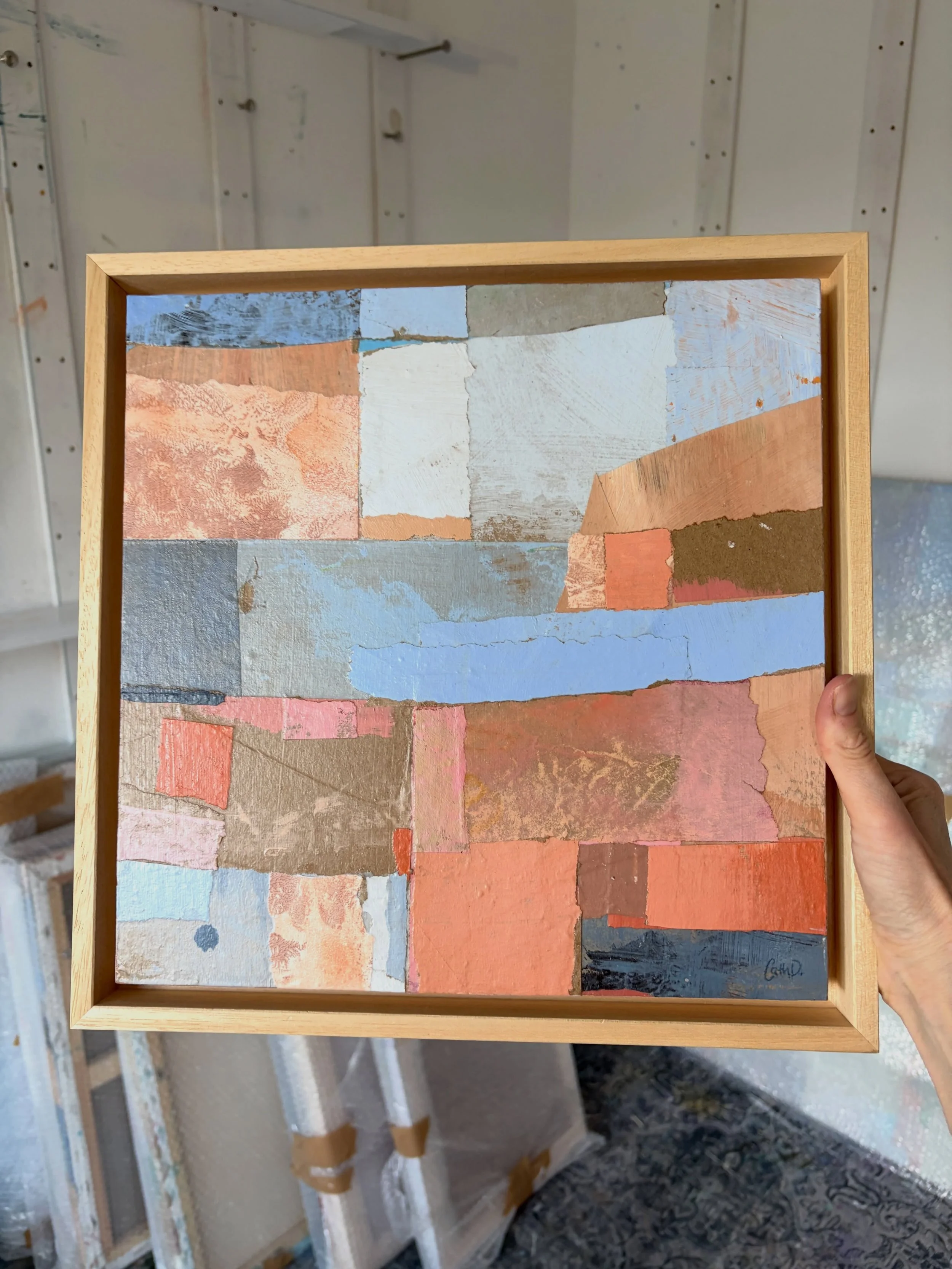
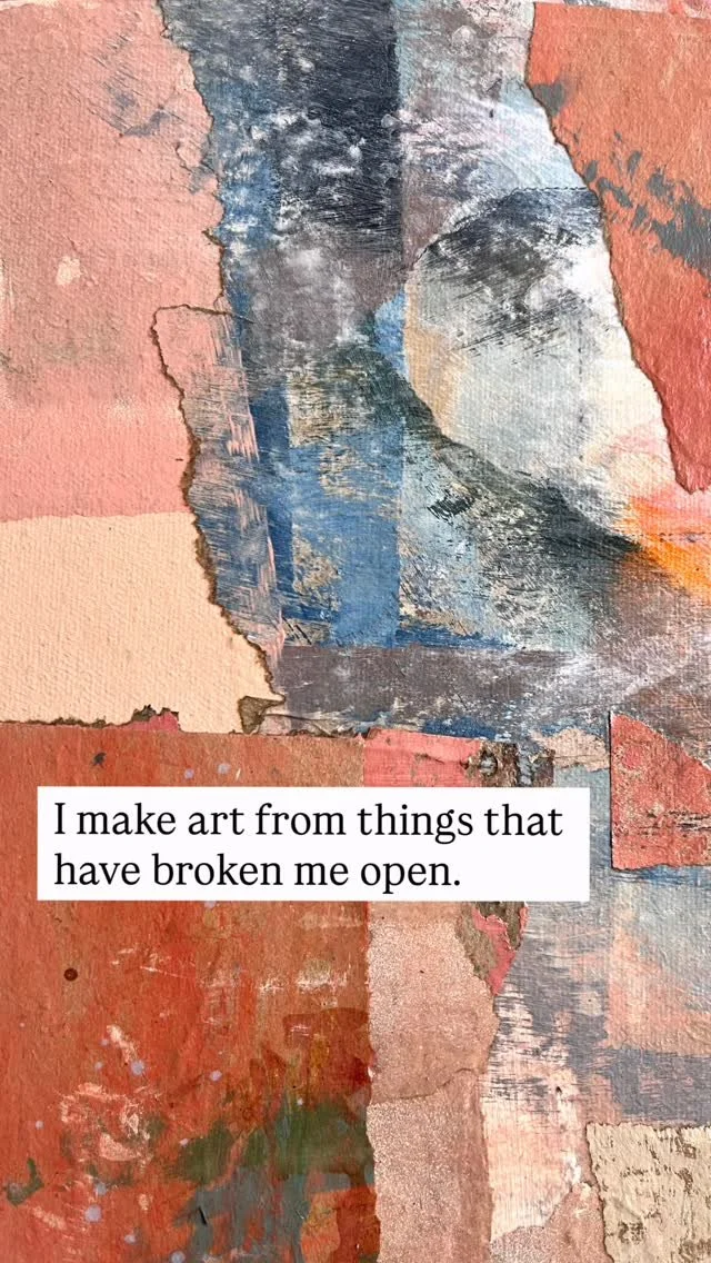
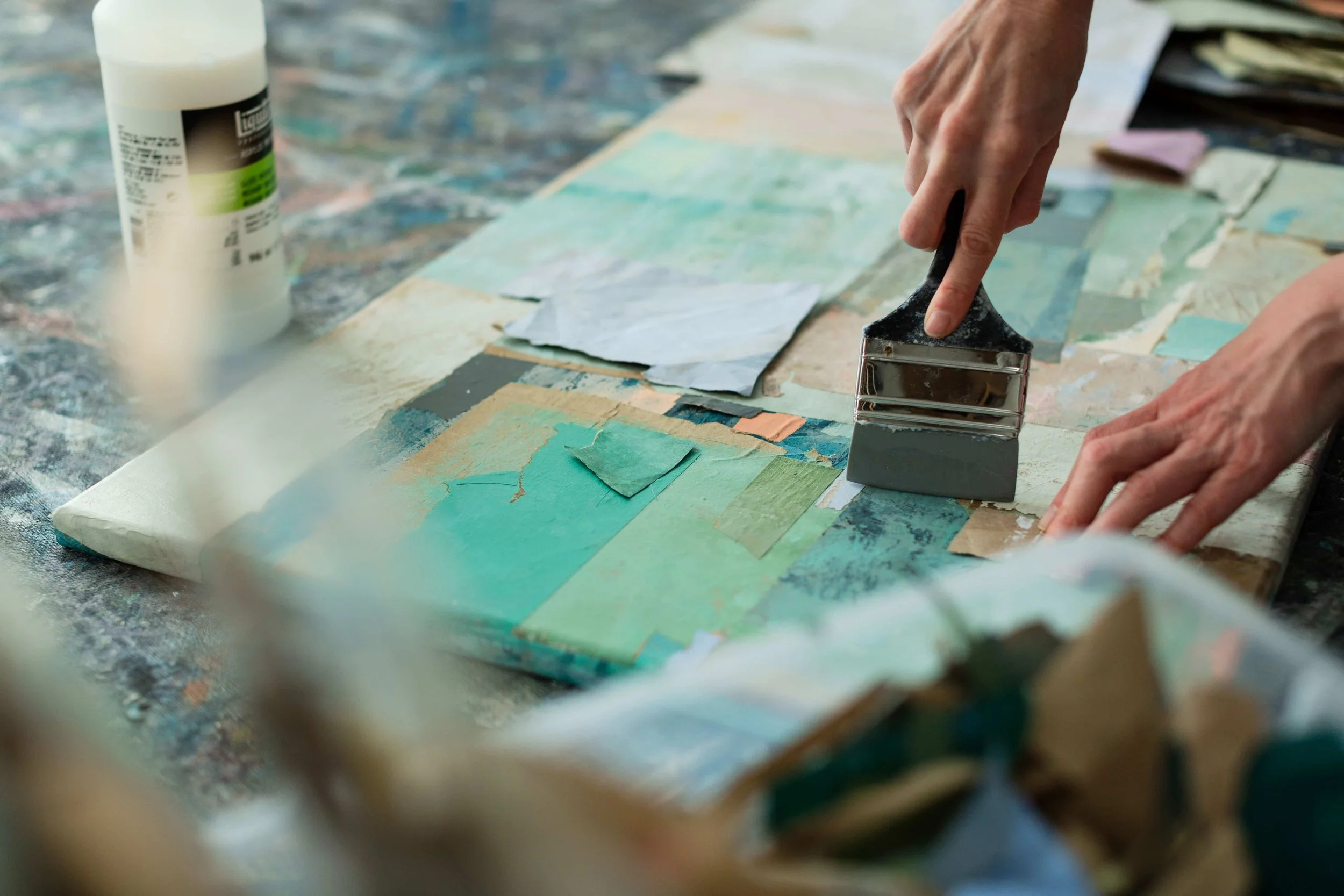
The artworks in my Topophilia series were created using recycled painted packaging papers, acrylic paint, and collage on canvas and wood panels. The packaging papers once protected, cleaned, or wrapped the tools and surfaces of my studio - they already bear traces of earlier creative moments, having served as table coverings, colour tests, or brush-cleaning sheets.
By painting, tearing, layering, and reassembling them, my work enacts a process of regeneration: an affirmation that beauty can be created out of what has been torn apart, that purpose and meaning can be transformed, and that personal, social, and ecological renewal are always possible.
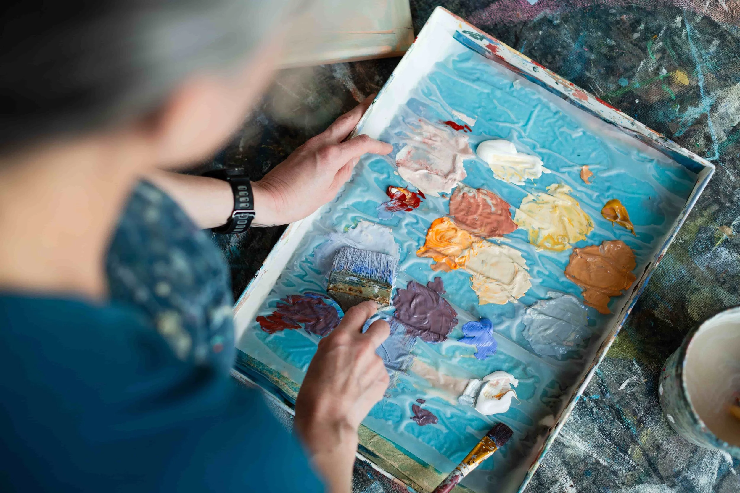
Choosing colours for their emotion & symbolism
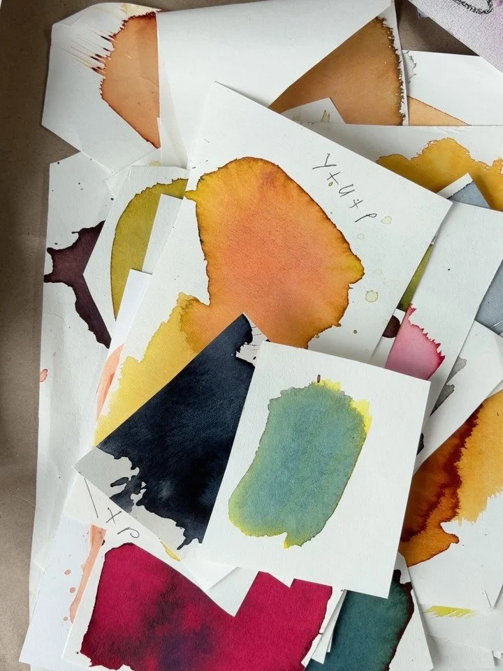
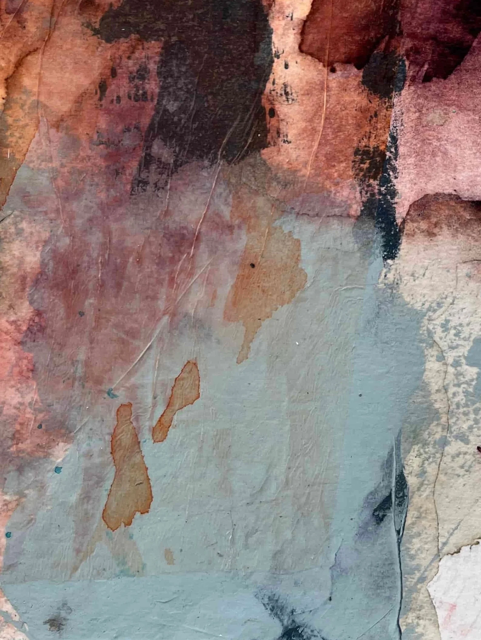
Colour is the first language communicating the emotional narratives of my work. I work with rich, earthy, harmonised hues.
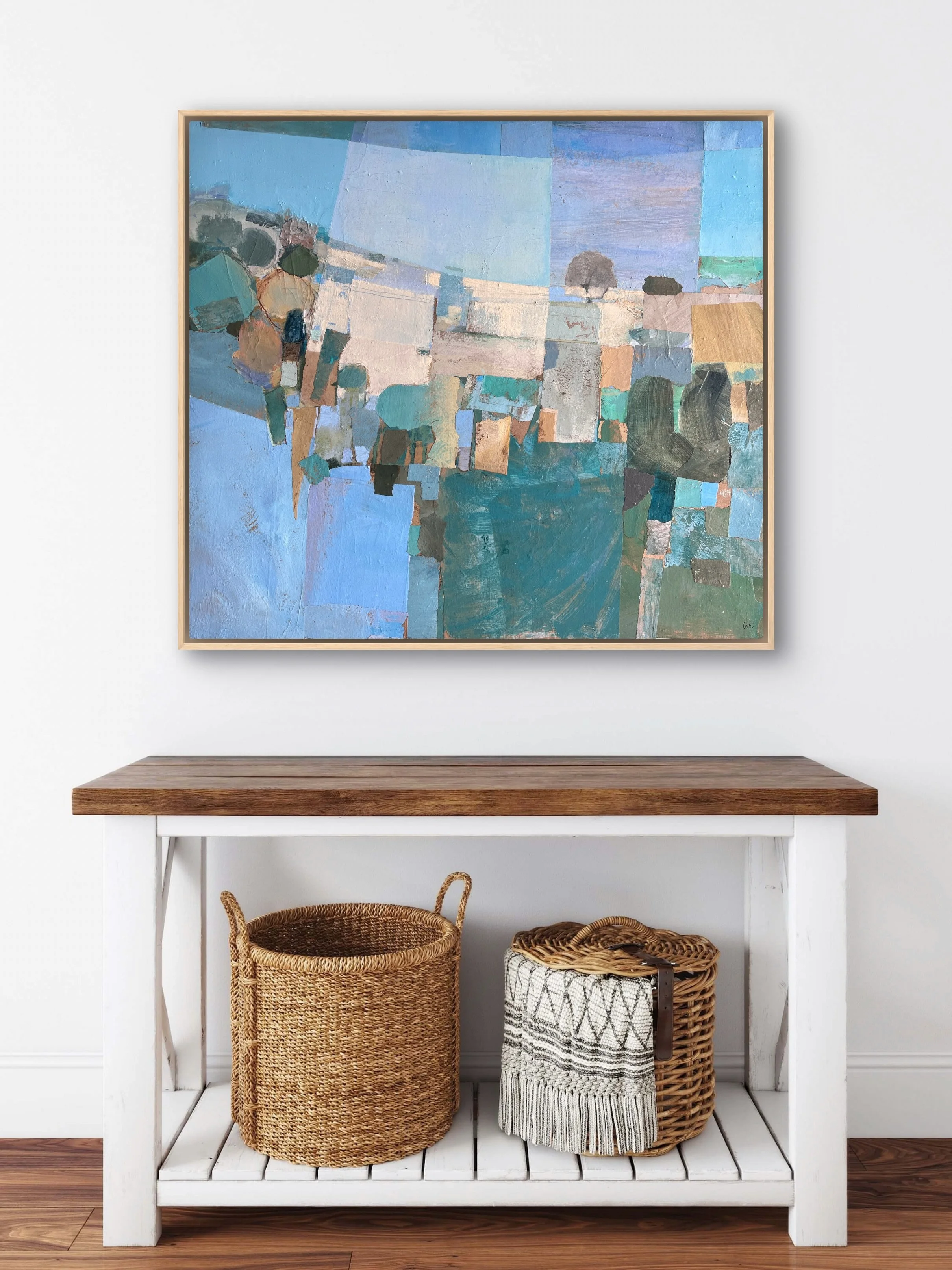
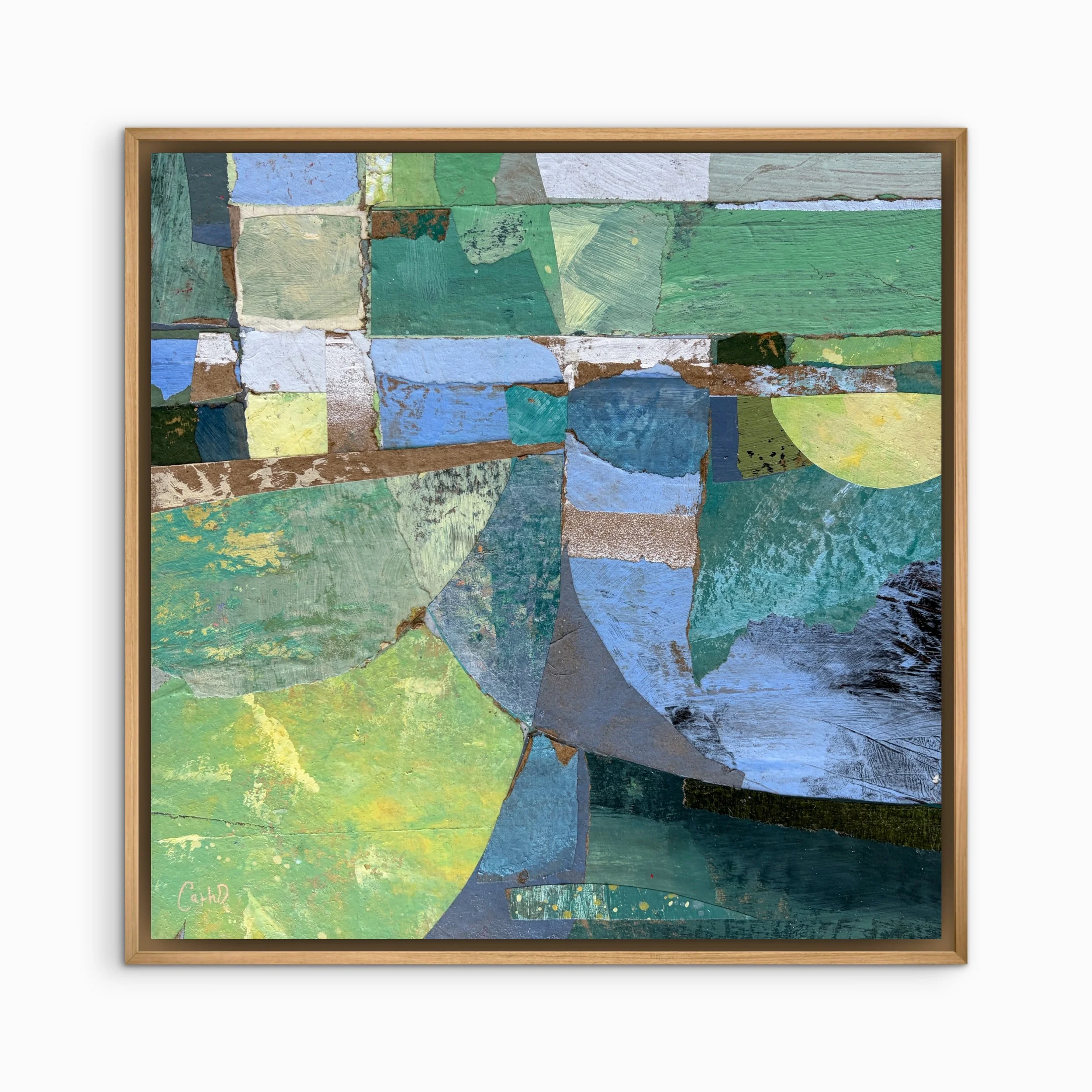
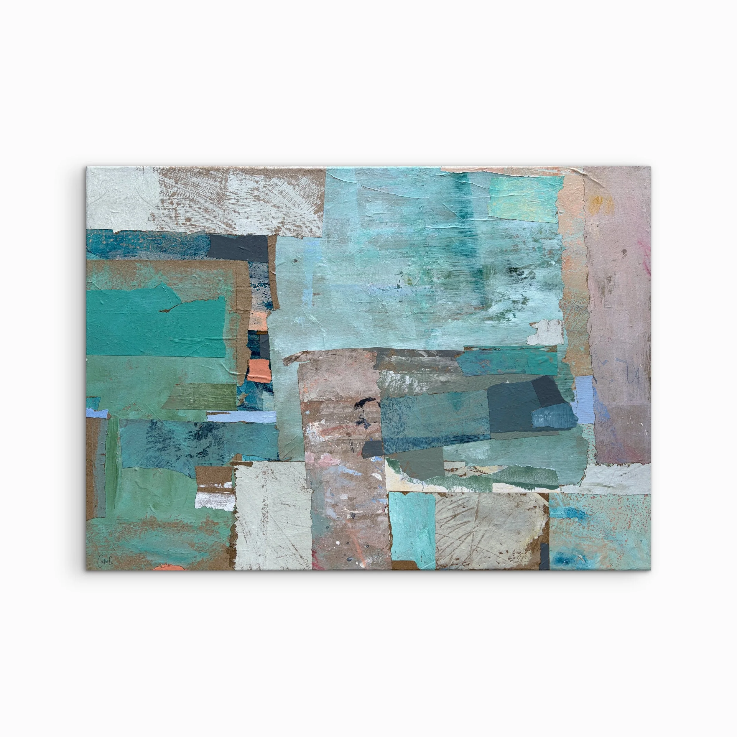
Terracottas and blues feature prominently in the Topophilia series. Terracotta hues speak of earth, ancestry, and grounding - the histories and places that hold us. Blues evoke sky and water, shared air, expansiveness, possibility, and hope.
Together they express the tension and harmony between rootedness and openness - both essential ways of being in the creation of belonging.
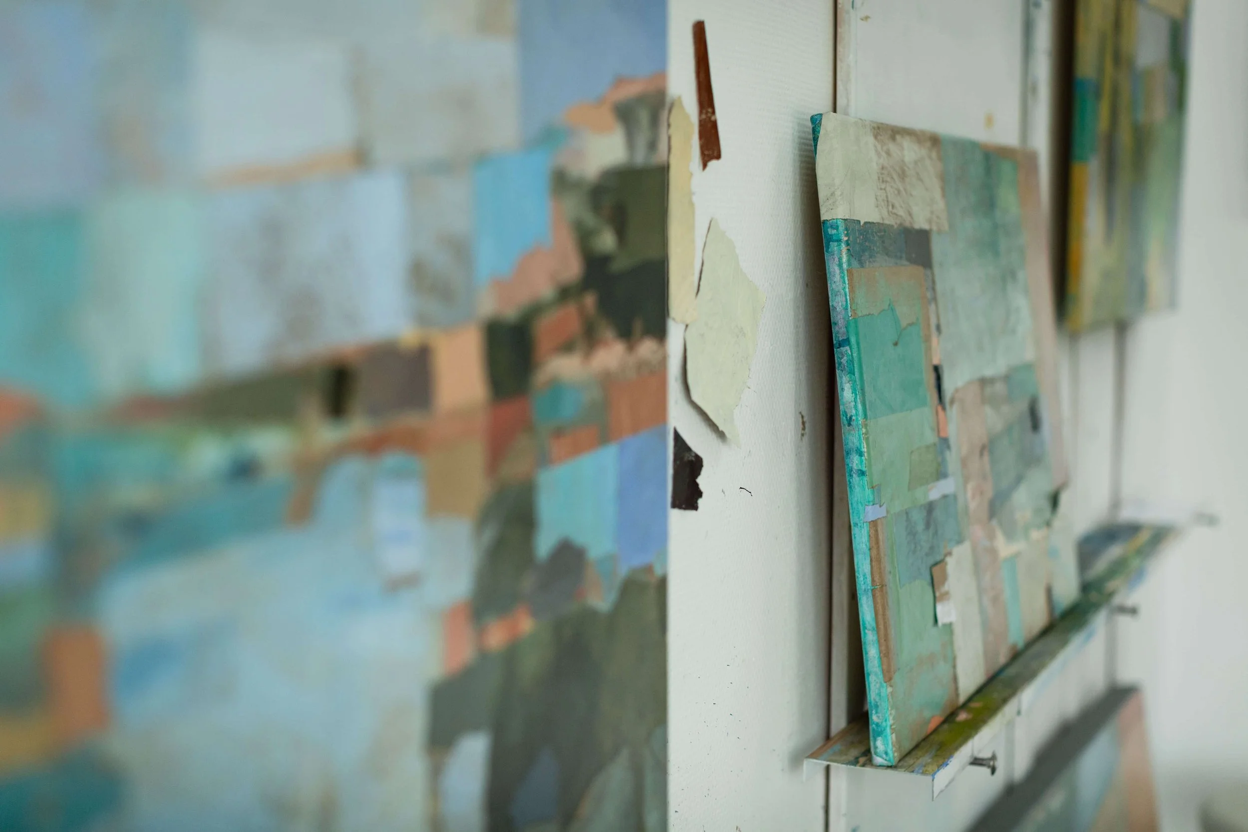
The borders & edges we live with
Vertical lines and unexpected divisions suggest the literal and figurative boundaries that shape our lives: political borders, social identities, physical limits, and rigid ways of thinking. Hard edges reflect the sharp lines that grief draws across our lives - marking the stark moment when life became "before and after" the loss.
Where colours and textures bleed and overlap, the works open into moments of connection, growth, and the possibility of shifting, softening, or overcoming the boundaries that have been constraining us.
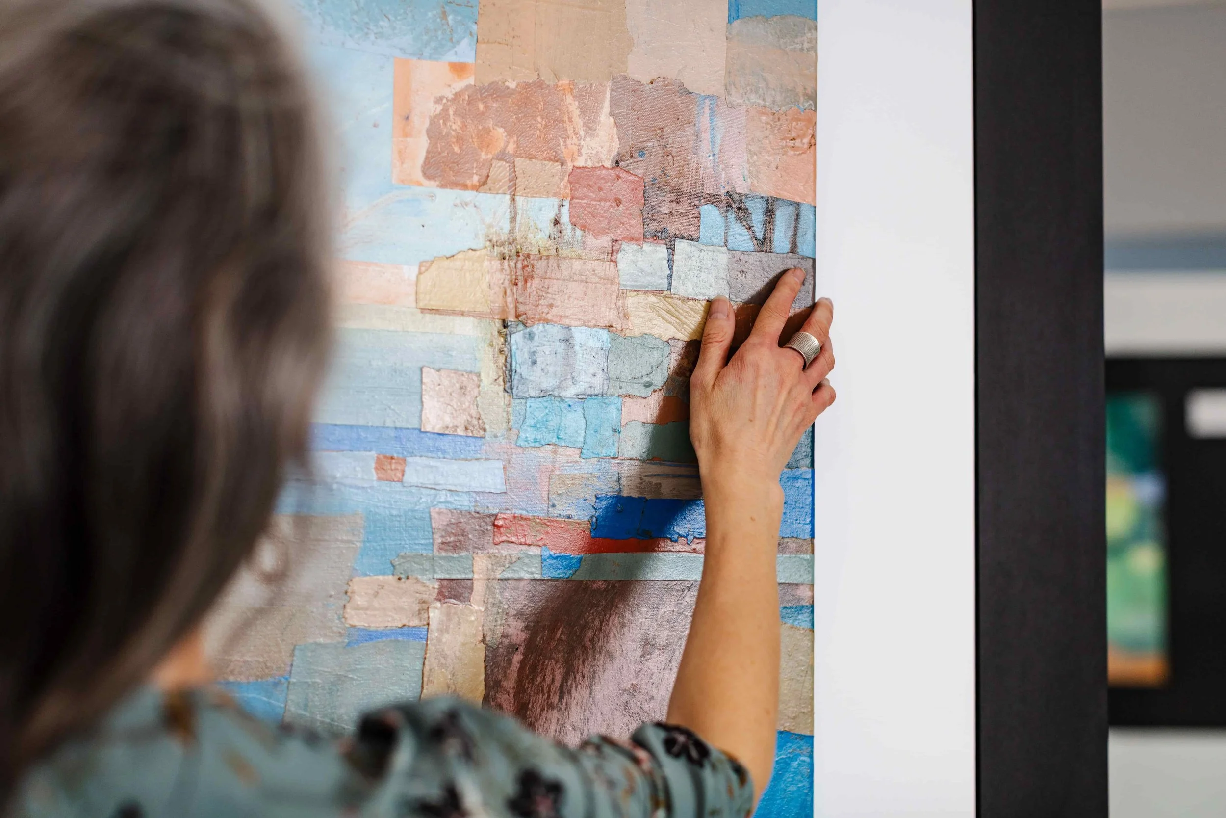
Textural & sensory delight
Rich, tactile surfaces form an essential element of the visual language. These textures emerge through spontaneous and unconscious layers of paint built up on recycled packaging materials. The warm brown of the underlying paper is a unifying presence - visible in the gaps between painted forms, emerging through thin glazes, and revealed where the paper has been torn or folded.
These traces of earlier lives and processes remain part of the finished works, holding the history of their making and reinforcing the Topophilia collection’s themes of repair, transformation, and renewal.