Wrangling colour contrasts
I don’t think I’ve ever struggled with colour relationships in an artwork as much as I have with this artwork…
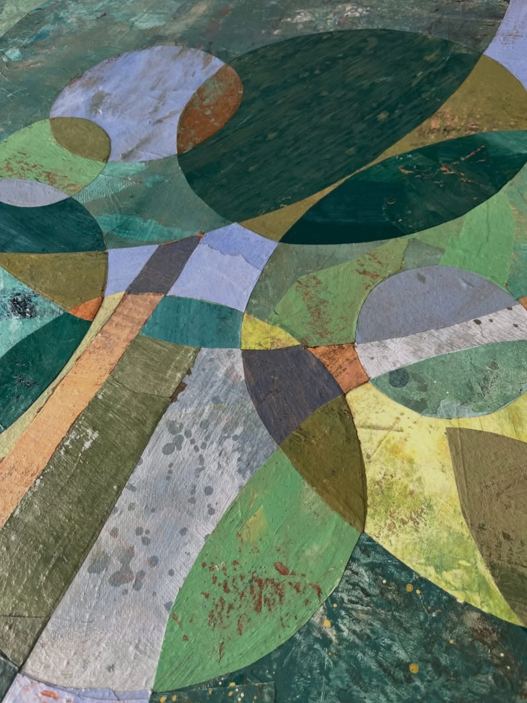
Three sets of complementary colours and high contrasts in value and high contrasts in saturation has made for a lot of clashing, awkwardness, tension, and energy!
Colours bringing out the worst and the best in each other, fighting for attention, sulking in the corner, changing attitude completely when a new tone is brought into the conversation, saying something completely different depending on which colours are talking to each other…
Sound familiar?
It seems very fitting that this was my struggle - considering that the artwork is all about grafted fruit trees as a metaphor for a vision of families and societies where we live together in harmony without having to tone down our differences!
I’m happy to report that, after a lot of patient observing, negotiating, and giving and taking they finally found their places and settled into a harmony together to create “Flourishing Graft.”.